Websites Designed
Specifically for
Phone and Tablet
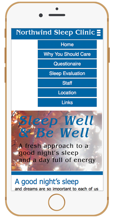
Accordian Style Menu
Pulls down from top
Easily read and select
all menu options
Touch-Centric interface
Mobile Devices are
automatically detected
The design is chosen to
match the device

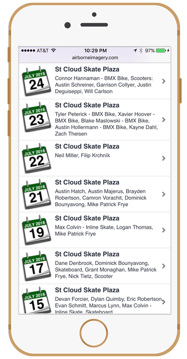
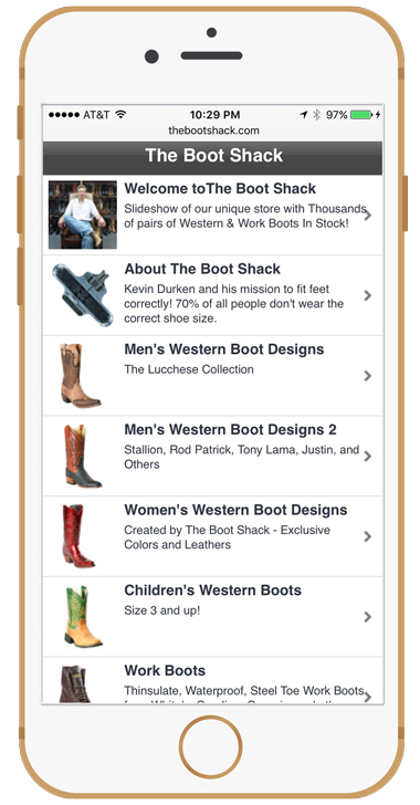
App-Like Interface
Select Menu Options
just like they were part
of a mobile application
designed specifically
for phone or tablet
Easily read text optimized
for the display size
of each device
Advanced Parallax
Scroll Motion
Pages pop on the screen when scrolled flipping over previous pages.
Advanced Interface that
brings site visitors back
time and time again to
the website
Click on each phone
to view the phone
specific website design
All links on this page will
go to phone specific
designs